1
Have colour confidence
Strong colours are most effective in small rooms or spaces such as entrance halls and dining rooms. If you’re concerned about bold shades stealing the limelight from your antiques, add them sparingly.
Alternatively build a bright scheme around your antiques using a favourite object or painting as the starting point.
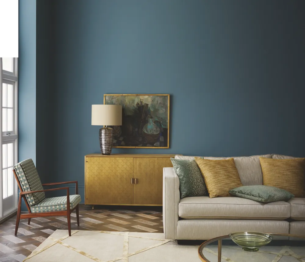
2
Make your paintings stand out
Hanging pictures is an art in itself and finding the right colour to use as a background is crucial. Historically, paintings in grand houses were displayed against red walls. More recently, white has been favoured.
Carol Jacobi, a curator at London’s Tate Britain, explains that coloured walls go in and out of fashion. ‘In Victorian interiors, displays of art photography followed the aesthetic taste for earthy shades of brown and olive on the walls, while colour photographs of interiors taken in the early 20th century reveal an artful orchestration of coloured papers, fabrics and artefacts against which to display art.’
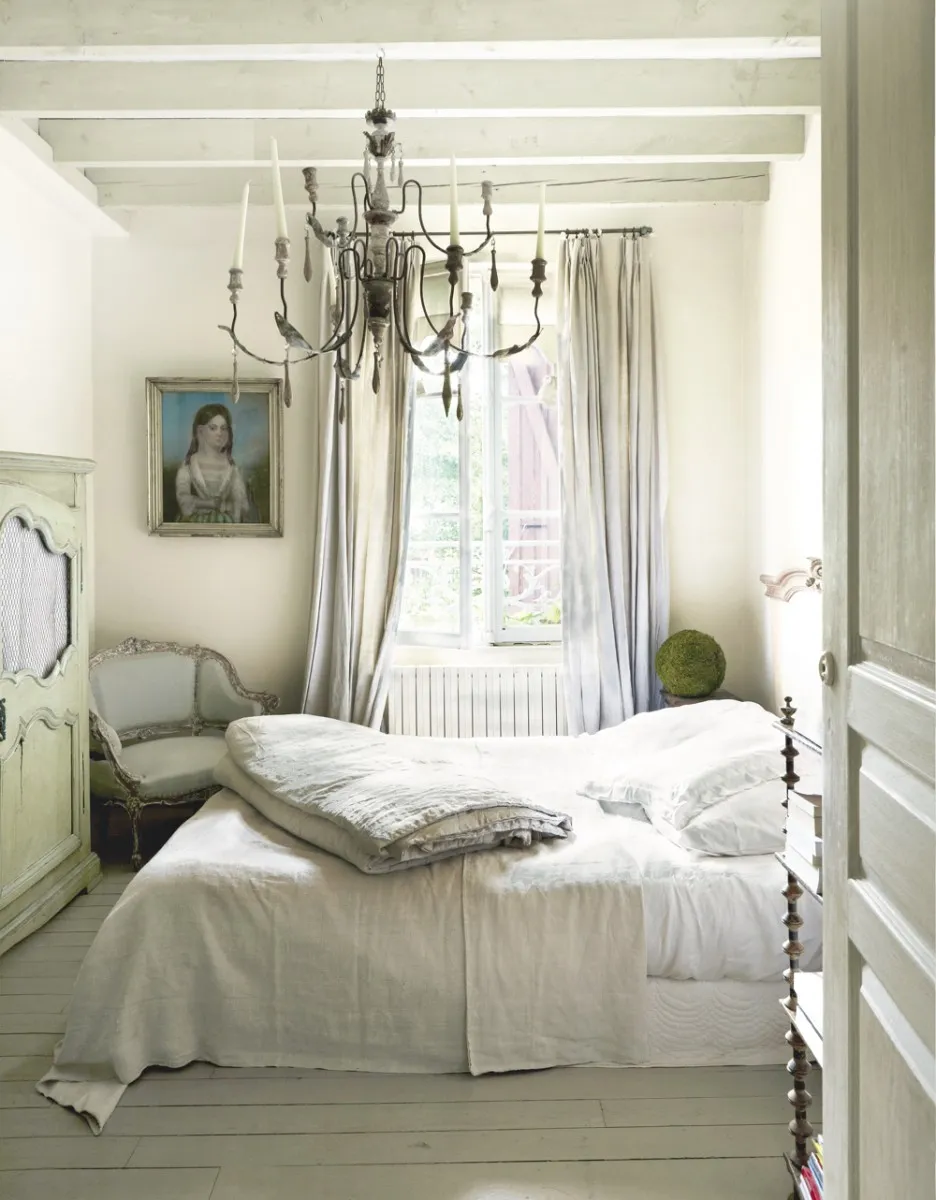
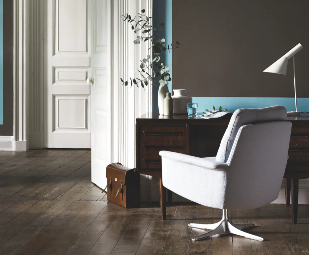
3
Create atmosphere
Visualise a room that’s romantic or sophisticated and colour is sure to feature. It's a powerful decorating tool. Light, cool tints make spaces seem open and airy, while warm hues give a sense of cosiness. Green is thought to be restful, red is stimulating, while yellow is the colour of happiness.
Interior designer Abigail Ahern is a big fan of deep shades: 'People are scared that dark colours might be depressing but actually they’re snug and sophisticated.' Good lighting is essential in darker schemes, as is contrast. Use more than the normal number of light fittings.
You may also like
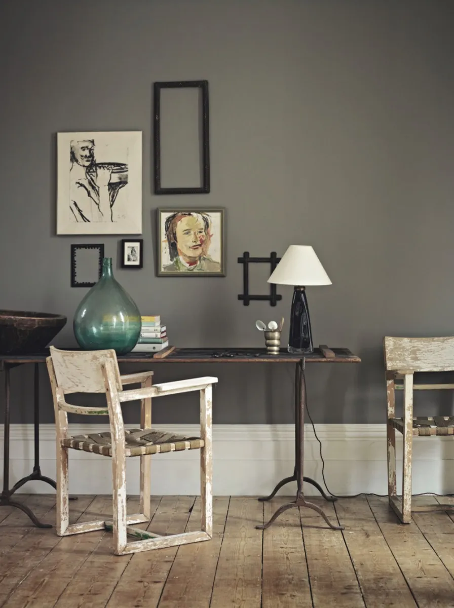
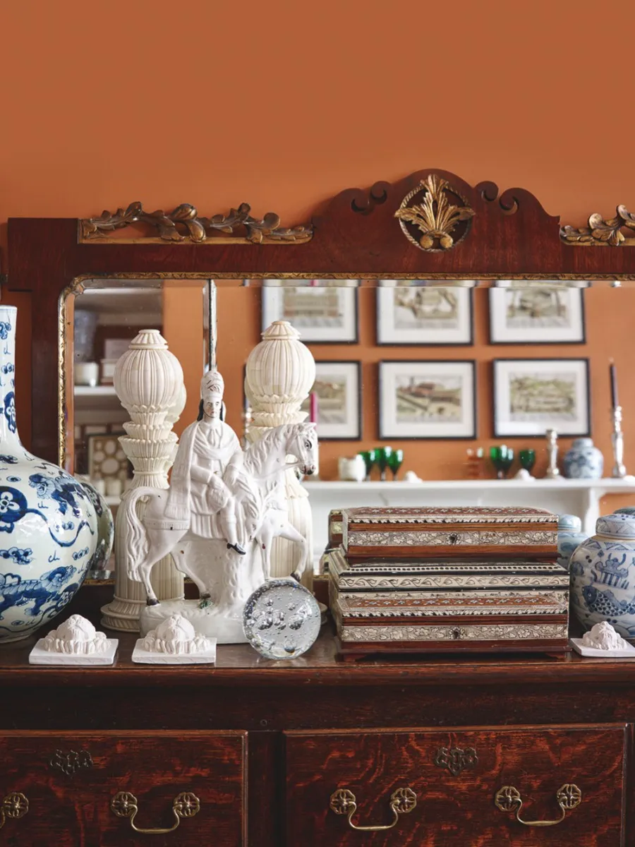
4
Showcase your antiques
Choosing a wall colour that will make the tones of antique wood furniture sing out is subjective, as different timber species are variously light or dark and warm or cool in character.
‘I find any paint colour works with antique brown furniture provided the base tone is clean and fresh, not drab,’ says Bridie Hall of Pentreath & Hall. Try ‘The Long Room’, a caramel colour by Paint & Paper Library, or ‘Parsonage Pink’ by Papers & Paints.
Upkeep is also important. Keep pieces waxed and polished to build up lustre. The reflection of the light will give a beautiful finish against a coloured wall.
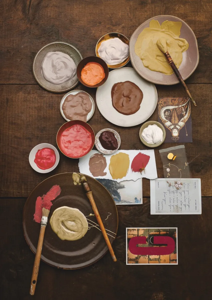
5
Prepare your walls
Painted walls are less forgiving than patterned wallpapers, which can disguise flaws in less than perfect surfaces. For a good finish, it’s vital to spend time on preparation.
Whatever their condition, walls should be washed down with a sugar soap solution to remove dirt and grease, and any holes or cracks in the plaster repaired with filler and sanded to a sound, even surface. Try hanging a non-woven smooth lining paper on uneven walls. On walls that have been painted before, a primer sealer such as Zinsser will give a better finish.
6
Make your walls period appropriate
An easy way to make sure that your wall colour fits with your home and collections is to choose from a paint range that divides its colours into well-researched collections.
For fans of mid-century design, one of the best places to search is Little Greene’s ‘Colours of England’ range. Separate palettes have been devised for the 1930s, 50s, 60s and 70s.
Vintage style is a less prescriptive look. Try Susie Watson Designs for paints in gentle colours as well as floral and sprig-printed fabrics, furniture and accessories.
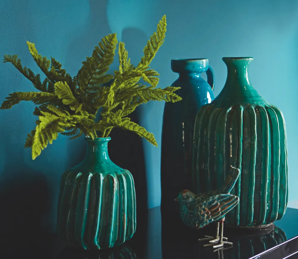
7
Use colour to unite
Most of us own a mix of things that give great pleasure individually but perhaps don’t gel together as a group. One way to unite them in a cohesive display is to assemble objects that share a common colour, material, period or theme.
Another way is to paint a shelf unit or alcove in a colour that will embrace all the elements in the collection. Don't choose white as an eclectic mix of pieces really needs a strong background colour to pop out. Try deep greys and blues.
8
Give your furniture context
Walls decorated in heritage colours put antique furniture into context and give rooms an integrated look. Companies such as Farrow & Ball, Craig & Rose, Dulux and Little Greene all offer historic paint colours, and most guide you to the period in which they were fashionable.
If you live in a house built in one period but love furniture from another, take your lead from your home. Don't ignore your furniture, though. Usually it's possible to find a scheme that suits both.