Do the vibrant designs of Clarice Cliff fill you with horror or delight? Does a pretty painting by Renoir make you smile or wince? Would the simplicity of a Bernard Leach pot thrill or bore you rigid? Above all, what governs your response to a work of art? Is it all a matter of personal taste?
Philosophers have long struggled to define what taste is. Kant said it was subjective, beyond reason, based on feeling and fashion. Whether or not you agree, within the world of collectables, a plethora of pieces are loved and loathed with equal fervour. Prevailing style and aesthetic judgement play a part – especially where experts are concerned – but does something else transcend them?
I ask seven experts to choose one piece they love and one they loathe. Their responses might surprise you, but a common strand emerges: although visual appeal and craftsmanship do play a big part in personal passions, it’s also the story behind the object and the pleasure it brings that matter.
Paul Atterbury
Art historian, author and Antiques Roadshow Miscellaneous expert

Love it
A silver and parcel gilt chalice by AWN Pugin, 1851 For me, Pugin was far and away the most exciting designer working in 19th-century Britain. A polymath of extraordinary originality, he made gothic the ‘right’ style for the modern Britain emerging in the first decades of Victoria’s reign. When he died in 1852, he left an amazing legacy of architecture, silver and metalwork, jewellery, ceramics, stained glass, books, wallpapers and textiles. While putting together the V&A’s 1994 ‘Pugin’ exhibition, I became deeply attached to this bizarre, complex, demanding and very appealing man.

Loathe it
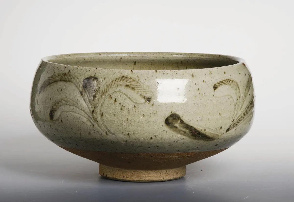
Bernard Leach pottery As an artist, potter and teacher, he was an interesting man, but I hate Bernard Leach. He is often called the ‘Father of Studio Pottery’. For me, this claim fails on two counts: one, there were more exciting studio potters before him and, two, he was of limited abilities, primarily making crude versions of early Far Eastern and 17th-century British pots. Nonetheless, his style dominated ceramic teaching at Britain’s art schools from the 1930s-1970s. As a result, Britain is awash with clunky pots in gloomy colours, indifferently made and with boring decoration. And they’re still being made.
You might also like where is the Antiques Roadshow filmed?
Jeanette Hayhurst
Glass dealer

Love it
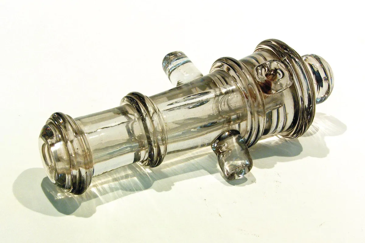
A 19th-century miniature glass cannon My favourite item is a 19th-century glass cannon. I love glass with a history and this cannon was mentioned in a newspaper report – it featured in a glassmakers procession of 1823 as part of a glass fort, defended by seven cannons. Much to the astonishment of the crowd, the London procession stopped outside the Mansion House and the model cannons fired a salute. You can still see signs of the firing. I first saw the cannon in an important exhibition called ‘Strange & Rare, the 50th Anniversary of The Glass Circle’ in 1987, then it disappeared until 20 odd years ago, when I saw it again for sale with a dealer. Because I loved its quirkiness and history I had to have it.
Loathe it
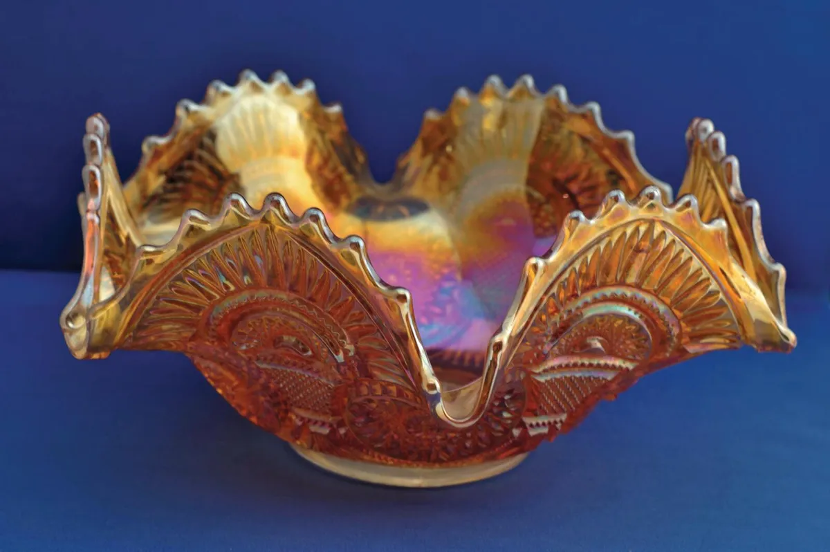
American carnival glass I specialise in 18th-century glass, although I deal in all periods through to modern, and I like most types of glass. But American carnival glass is an exception – I know there are some great designs, but it’s one thing I’ve never liked. My pet hate is the marigold colour – that iridescent orange really jars with me. My original dislike was compounded when I was on a trip to the US in 1986 and found myself invited to stay with the secretary of the American Carnival Glass Society. Not only was one wall of my bedroom entirely covered in carnival glass, but we spent three days touring collections of it, one in the morning, one for lunch and one for dinner. By the end I never wanted to see a piece of it again!
You might also like where to shop for antiques according to experts
Garry Batt
Partner and Senior Valuer at Duke’s Auctioneers

Love it
Bulbarrow oilon-canvas by Frederick Whitehead, 1894 I’d love to own this painting of Bulbarrow by the late-19th-century Dorset artist Frederick Whitehead, not just because of its obvious visual appeal, but because the works of art I enjoy most have a story to tell. This painting shows an iconic Dorset landmark and was commissioned by Thomas Hardy, a friend of Whitehead’s. When Duke’s sold the contents of Max Gate, Hardy’s home, the painting was bought by his physician, Dr Mann, who left it to his daughter, who was a neighbour of mine. She recently passed away and the painting came back to us for sale. It’s that circular story that gives it a special resonance – so, for me, it’s far more than just a beautiful painting of Dorset, it’s part of my story too.
Loathe it
Leather handbags by Mulberry I haven’t got anything against handbags per se, but because I have been an auctioneer for over 30 years, and was brought up in the school of Georgian and Victorian works of art, I can’t help feeling that handbags, and many of the other items that now fill our luxury sales, are out of place in a fine art and antiques auction room. In saying this I am well aware that I’m out of step with modern trends. All the young members of the Duke’s team are interested in this sphere and I can see why – some handbags sell for £30,000 plus. But, that said, I still find it impossible to see them as works of art.

You might also like the antiques you need to own according to experts
Frances Christie
Senior Director of Sotheby’s Modern and Post-War British Art and Antiques Roadshow Picture expert

Love it
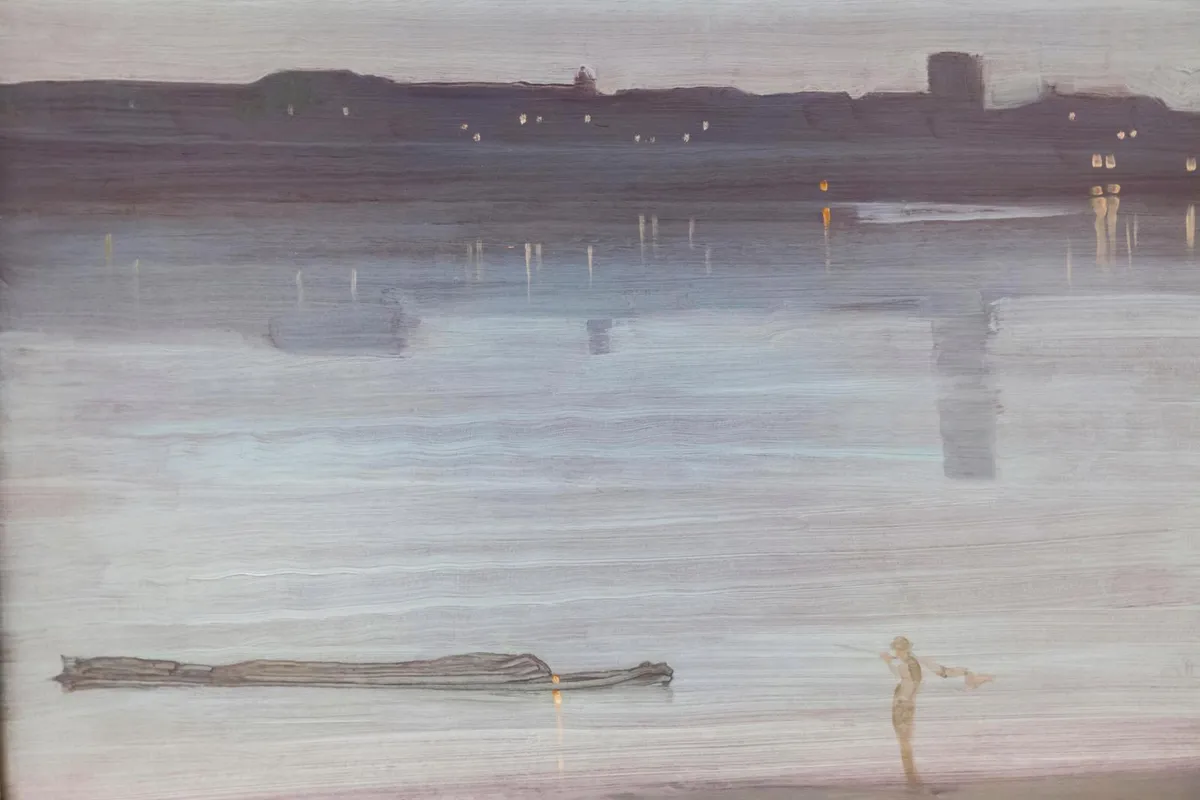
Nocturne in Blue and Silver by James Abbott McNeill Whistler, 1871 The picture I love is Nocturne in Blue and Silver – Chelsea by James Abbott McNeill Whistler, in the Tate. It’s a view painted in 1871 from Battersea looking across the Thames towards Chelsea, one of a series he painted at the time. The palette is wonderfully atmospheric – an evocative mix of blues and silvery greys with a hint of green. I love how he has contrasted the horizontal focus of the river with the vertical daubs of paint to highlight the glimmering lights and reflections in the distance and in the foreground, a person surveying the tranquil panorama. I could look at this all day, every day.
Loathe it
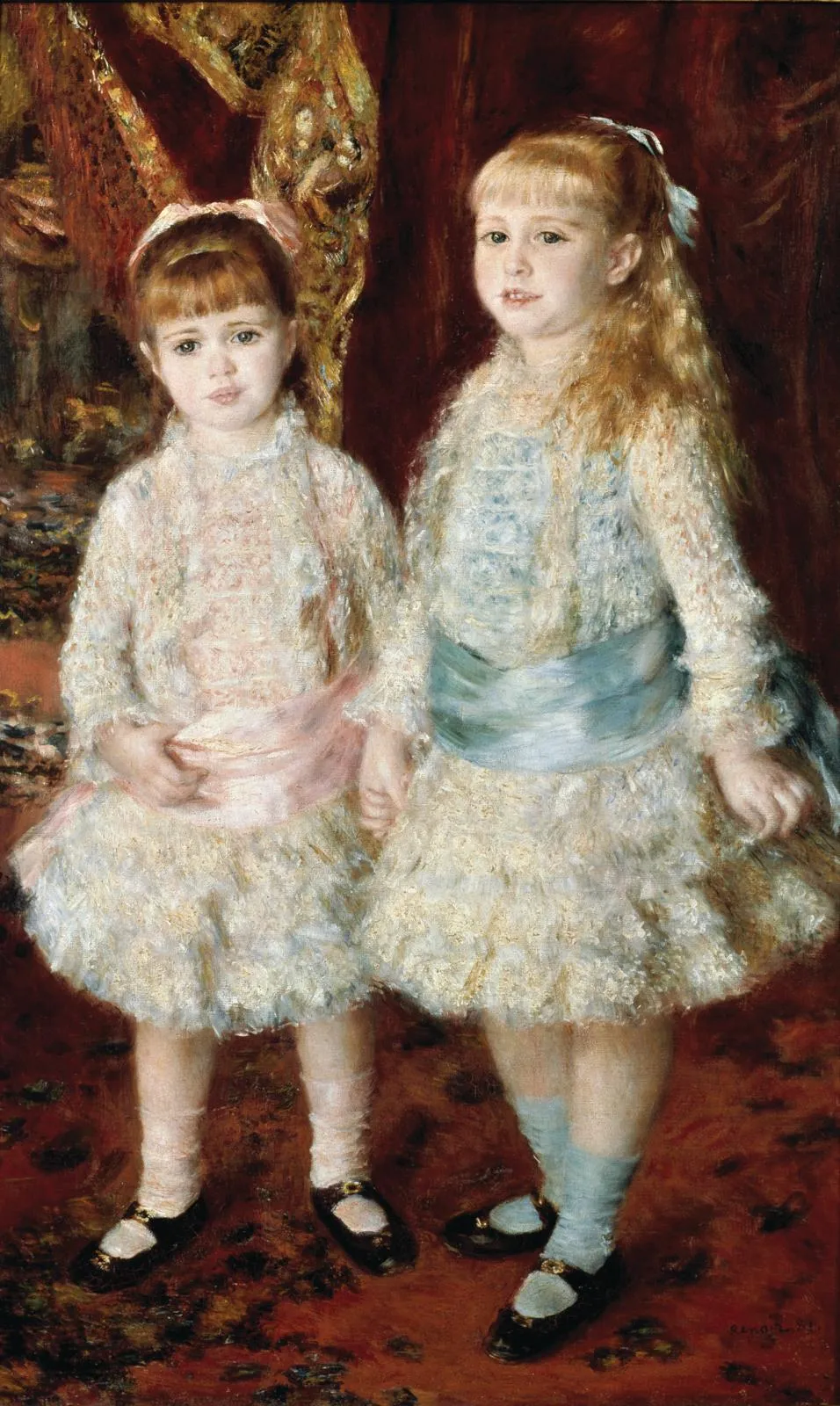
Pink and Blue by Pierre Auguste Renoir, 1881 By contrast, I really don’t like this painting by Renoir in the São Paulo Museum of Art. It shows Alice and Elizabeth Cahen, who were six and five when Renoir painted them, and to me they look awkward and unhappy, as if they’ve been forced into the picture. Another thing I don’t like is the clothes – the girls look like dolls. But perhaps they enjoyed the frills and lace. I do hope so.
You might also like behind the scenes of the Antiques Roadshow
Lisa Lloyd
Hand of Glory owner and Antiques Roadshow Miscellaneous expert

Love it
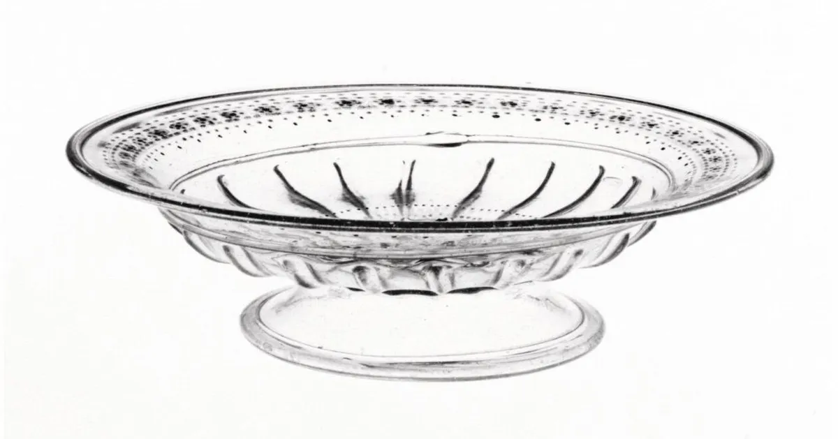
Regency glass Regency glass is something I love – I have a large collection of drinking glasses – but I think that, as a field, it’s rather undervalued today. When you consider the craftsmanship that went into making something like a beautiful cut glass decanter – it had to be handblown and then hand cut on a wheel, using extraordinary skill – I don’t understand why they are so cheap. If I had to choose one more piece that I’d like to own it would be a small Georgian glass tazza to complete a stack of three. I have the other two tiers, but I’d love the third.
Loathe it
Clarice Cliff My pet hate is Clarice Cliff. I appreciate that she was extraordinarily successful in an age when few women had careers, but I do think her work is overrated. Her skill was as a designer, and the bright modern designs themselves captured the spirit of the moment and jazz age, but the wares were made in vast quantities, to be sold in every department store. I think their success was aided by the company’s marketing skills, which included advertising leaflets in magazines, in-store painting demos and celebrity endorsements. While prices are not as strong as in the mid-1990s, people still love her, and there are countless copies. But my heart sinks whenever I see a piece.

You might also like inside Lisa Lloyd's antiques-filled home
Lennox Cato
Furniture dealer and Antiques Roadshow Furniture expert

Love it
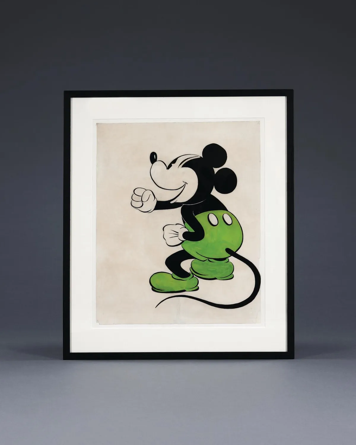
Early Disney art This image of Mickey Mouse probably isn’t what anyone would expect me to choose, but it hangs in my kitchen and, whenever I walk past, it always makes me smile. To me, it looks as if he’s saying something rousing, like: ‘Go get ’em Lennox!’ I bought the picture when I was having a break on the South Coast some years ago. I know that Mickey in green trousers predates Mickey in red, and although I’m not sure exactly how old this is, it’s clearly of some age. It’s on old paper, hand-painted with gouache, pen and ink, and I think it probably dates from the late-20s or early-30s. But whether it’s an original artwork made by Walt Disney himself or not, I just love it.
Loathe it
Vintage plastic toy cars What really annoys me are the cheap, mass-produced, plastic throwaway toys that people have started collecting, not because they like them, but because they think they will increase in value. To me, this is a sad reflection of the modern obsession with materialism and not what collecting should be about. Toys like these weren’t made to last, and they have negligible artistic merit. It infuriates me that people buy them just for investment. They may as well go to the casino.

You might also like Lennox Cato on his love for antiques
Anthony Kilroy
Director of Lawrences Auctioneers and a specialist in objects of vertu

Love it
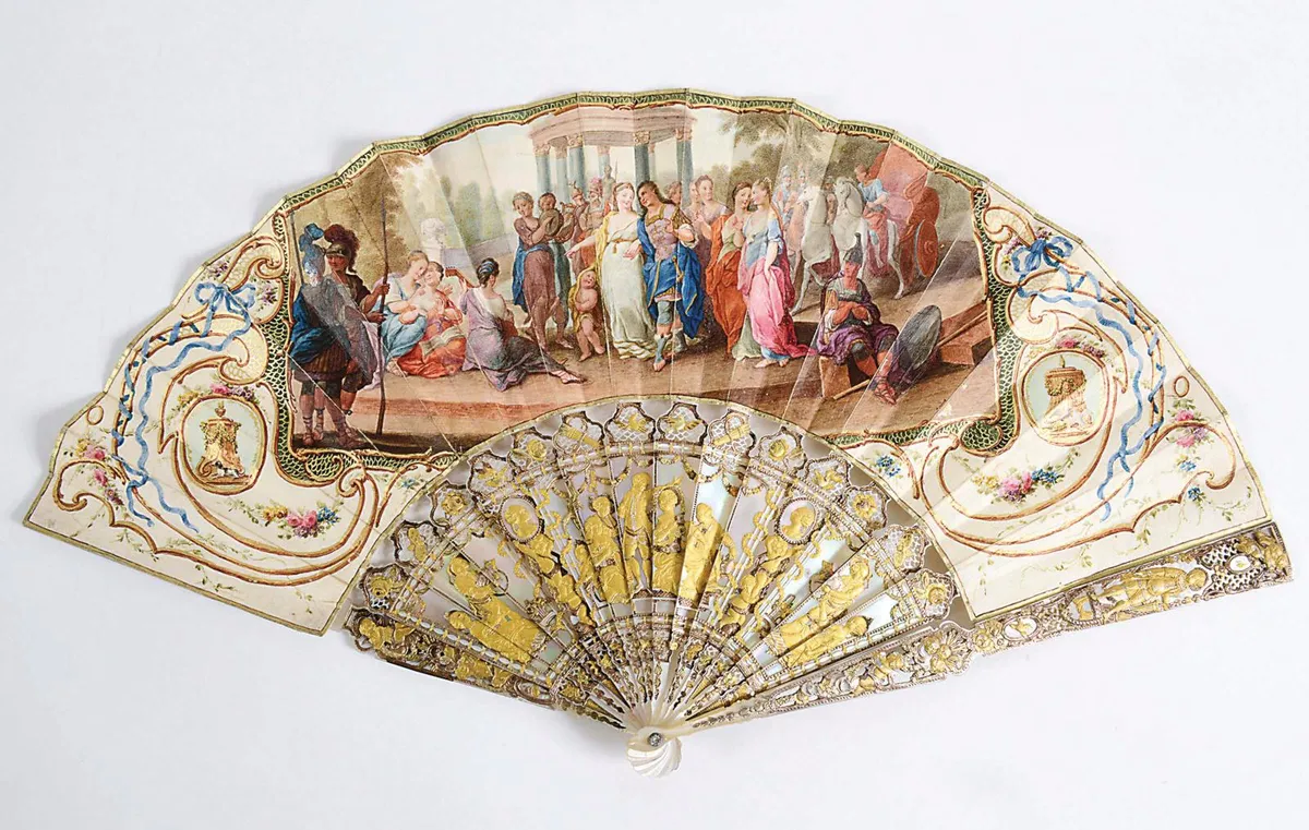
A fan with mother of pearl guards and vellum leaves I’ve chosen this 18th-century French fan because of the quality of workmanship, a prerequisite of a fine object of vertu. Mother of pearl is not an easy material to work, but the sticks are beautifully carved and pierced, as well as being gilded. The vellum leaves are painted with a neoclassical wedding scene that fills the space well, surrounded by delicately painted flowers and ribbons. It is almost a piece of jewellery in its own right in its attention to detail.
Loathe it
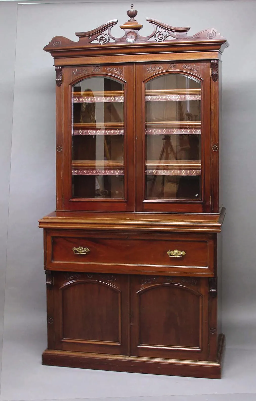
Oversized 19th-century mahogany furniture This late-Victorian bookcase is not the sort of thing I would choose to live with. It’s top-heavy and the deep secretaire drawer makes the cupboards below look squashed into the floor. In looking at almost any object I think proportions are key. They may be exaggerated to make a point, but should be satisfying to the eye. This bookcase also fails for me in its colour. One of the joys of old wood is that it can be a bit faded and marked but show a depth of patina, almost talking to you through the years…