One of the best-loved and most iconic of this country's china colourways is blue-and-white. You need think only of Spode's 'Willow' pattern to realise how widespread it has become. Throughout the 19th and 20th centuries this early pattern – created by Spode in the 1790s – was copied by many other potteries. Indeed, Churchill China of Stoke-on-Trent still produces its 1818 version, 'Blue Willow', today.
In our April issue, we meet Rhian Malin whose fine blue-and-white vessels are inspired by her grandmother's 'Willow' pattern dinner service. While her shapes are incredibly modern, the classic colour pairing sets them in a long historic tradition. You can watch a video of her at work here.
With spring on the way (and plenty of display ideas in Homes & Antiques' April issue), what better time could there be to dust off your blue-and-white china? Read on for ways to put it on proud display.
Mix your textures
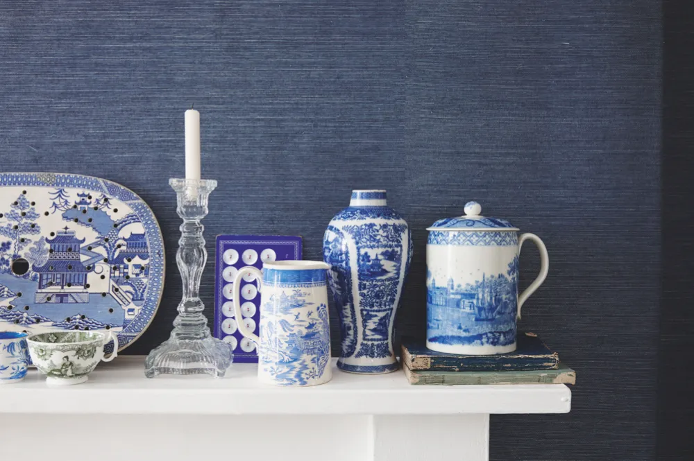
A striking yet subtle way to vary a one-colour collection is to contrast textures. You can do it with objects or with decor. Take this mantelpiece for example: the 1800s Spode porcelain (found at Aurea Carter and Sunbury Antiques Market) is seen afresh against the backdrop of Thibaut's 'Shang Extra-Fine Sisal' wallpaper in the appropriately named 'Wedgwood Blue' (£160 per roll).
Play with prints
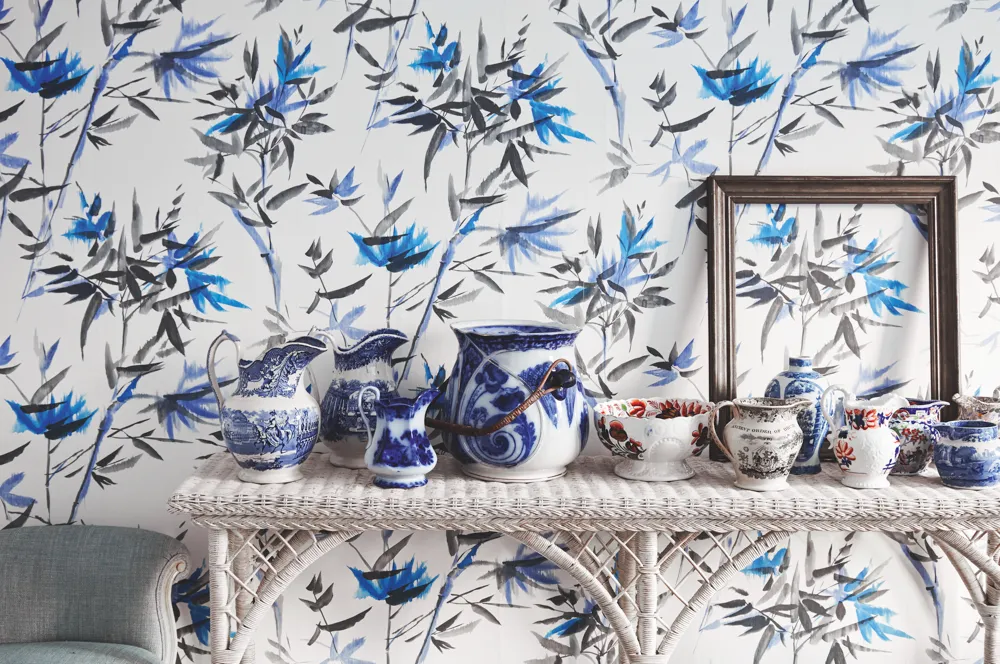
Even though the ceramics are printed and patterned, that doesn't mean you can't go maximalist with your backdrop. We love the bold, Chinese-inspired wallpaper ('Bamboo' in 'Cobalt' from Designers Guild for £79 per roll) floating behind the array of 1880s and 1890s vessels. The vintage frame found at Sunbury Antiques Market provides a bold focus.
Vary your collection
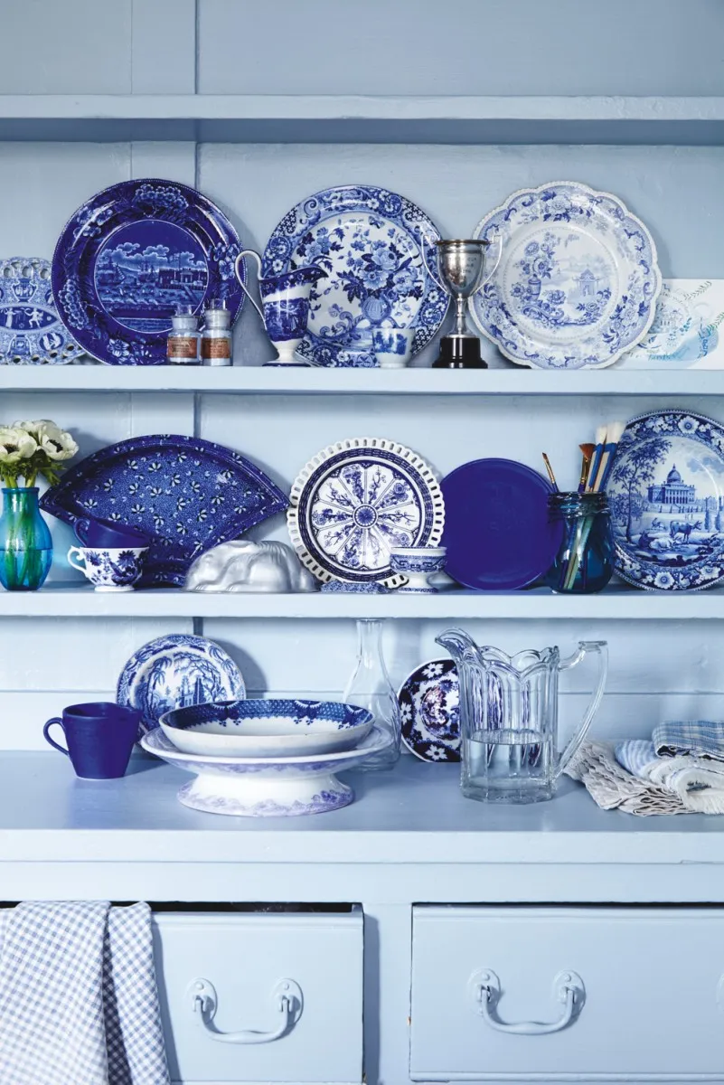
Don't be afraid to build a collection of mismatched patterns of antique transferware. Whether it's for use or display, mixing designs, eras or even the odd variation of colour will add plenty of visual interest. Much of what is shown in this picture was found at Premier Antiques. The look is made modern with the addition of the bold blue glass vase from Green & Stone on the far left and the softening addition of fabrics.
Display in surprising places
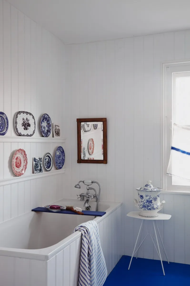
You don't have to limit your china to the kitchen - why not enjoy it in the bath? Lips and lintels around the house provide handy resting places for displays of plates or tiles. Keeping the colour scheme largely blue and white keeps the look bright and nautical in mood.
Be informal
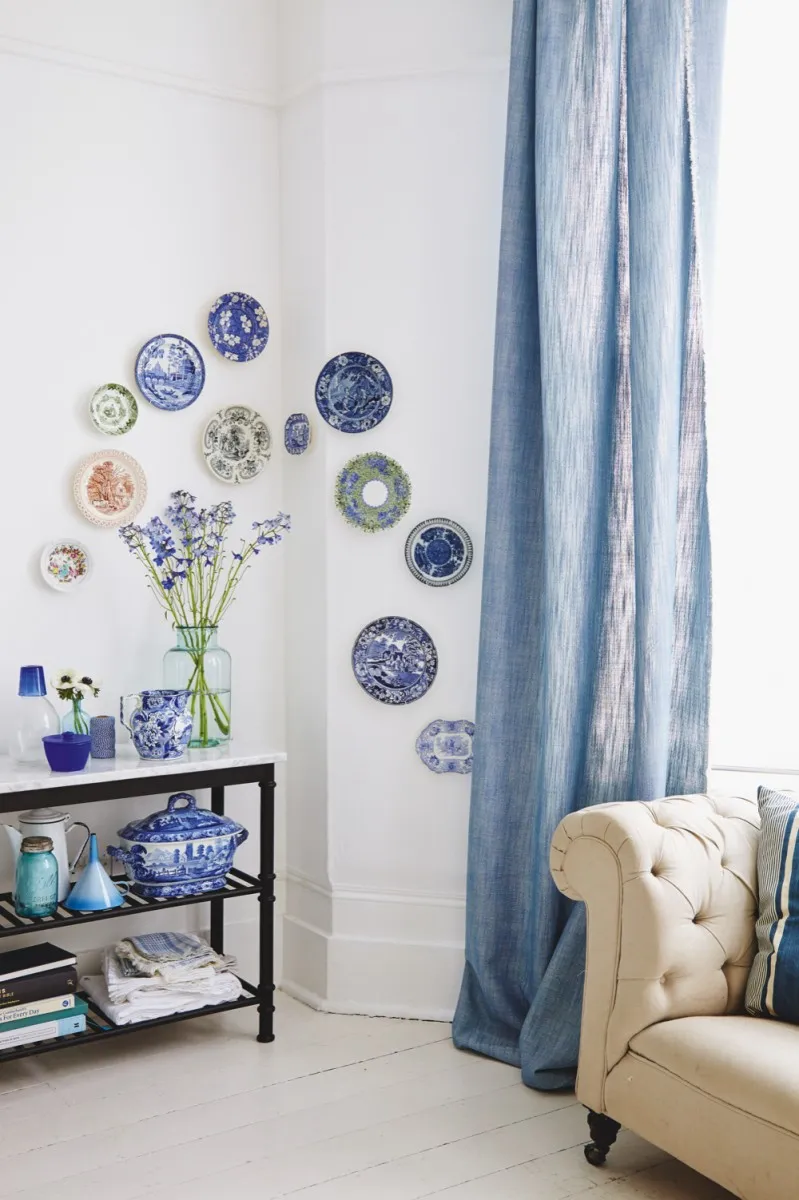
Carefully measured displays of plates on the wall lends a more traditional and staid mood to a room. Update this classic idea with a more playful arrangement, letting the plates pop out from behind airy curtains. The material used here is 'Rumba' in 'Persian Blue' by Romo (£39.50 per m).
The full feature on transfer-printed ceramics appeared in the May 2015 issue of Homes & Antiques.

