
It’s so easily done. You’re decorating or styling a room and you think you’ve nailed it. But, standing back to observe, you notice there are one or two things that just don’t feel right. There’s a niggle, but what exactly is it?
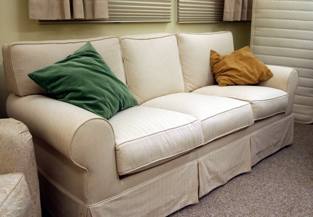
It’s usually something that is making your scheme look cheap that’s hard to identify. Is it the curtains? Is it something on the mantelpiece? The wall? The floor? Happily, here’s a checklist of design mistakes to help you spot some common oh-so-subtle anomalies…
1. Underwhelming accessories
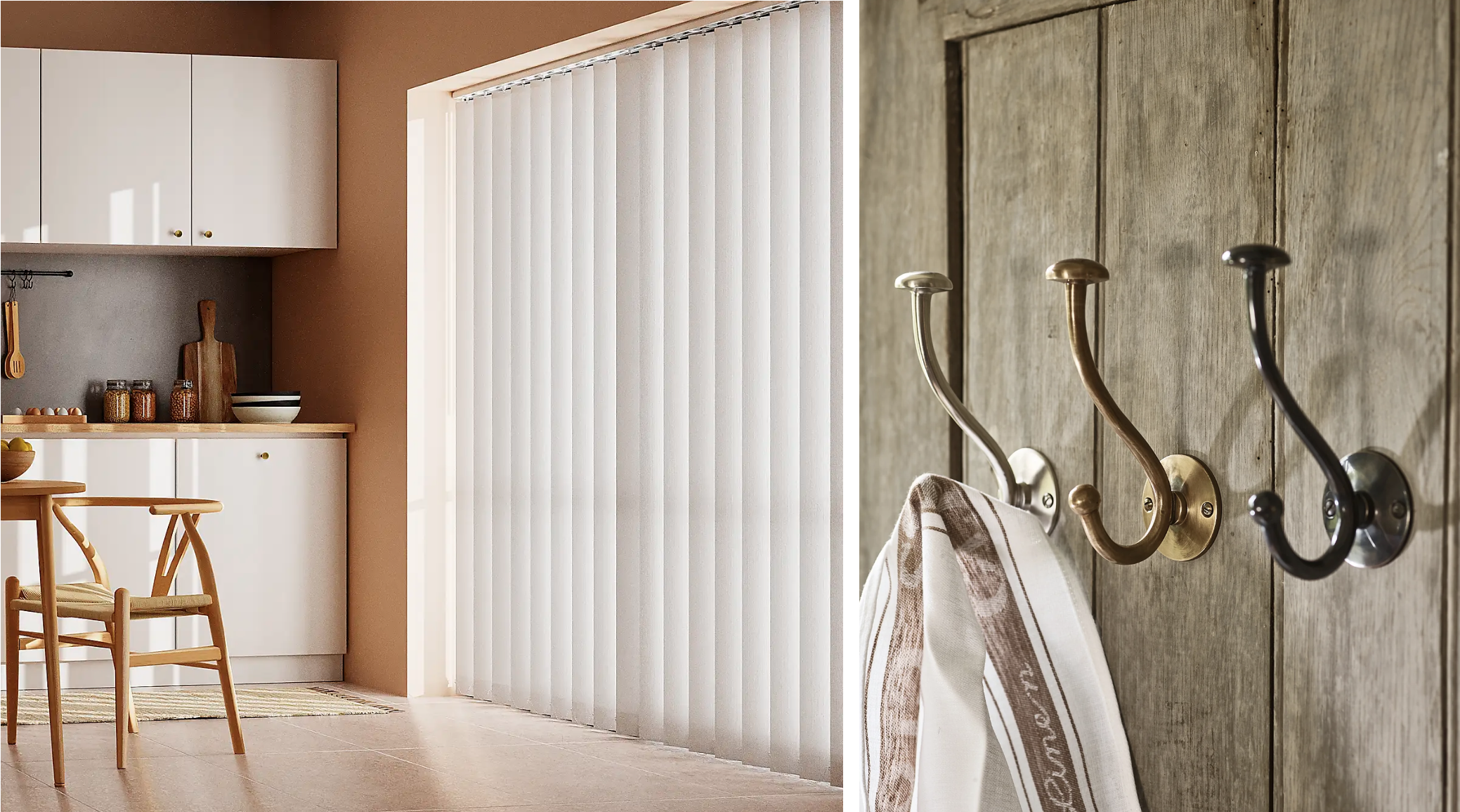
Flat, shapeless, beige, or generally underwhelming cushions; grey vertical blinds; frameless mirrors; and practical (but certainly not pretty) chrome coat hooks… these may all seem small and insignificant items in terms of home decoration, but they can really let a house down by making rooms feel cold and uninviting.
For an affordable upgrade, consider plump feather cushions in tactile velvet from Dunelm, linen curtains from H&M Home, a framed mirror from Cox & Cox, and characterful hooks from Rowen & Wren or Oliver Bonas.
2. Poor lighting choices
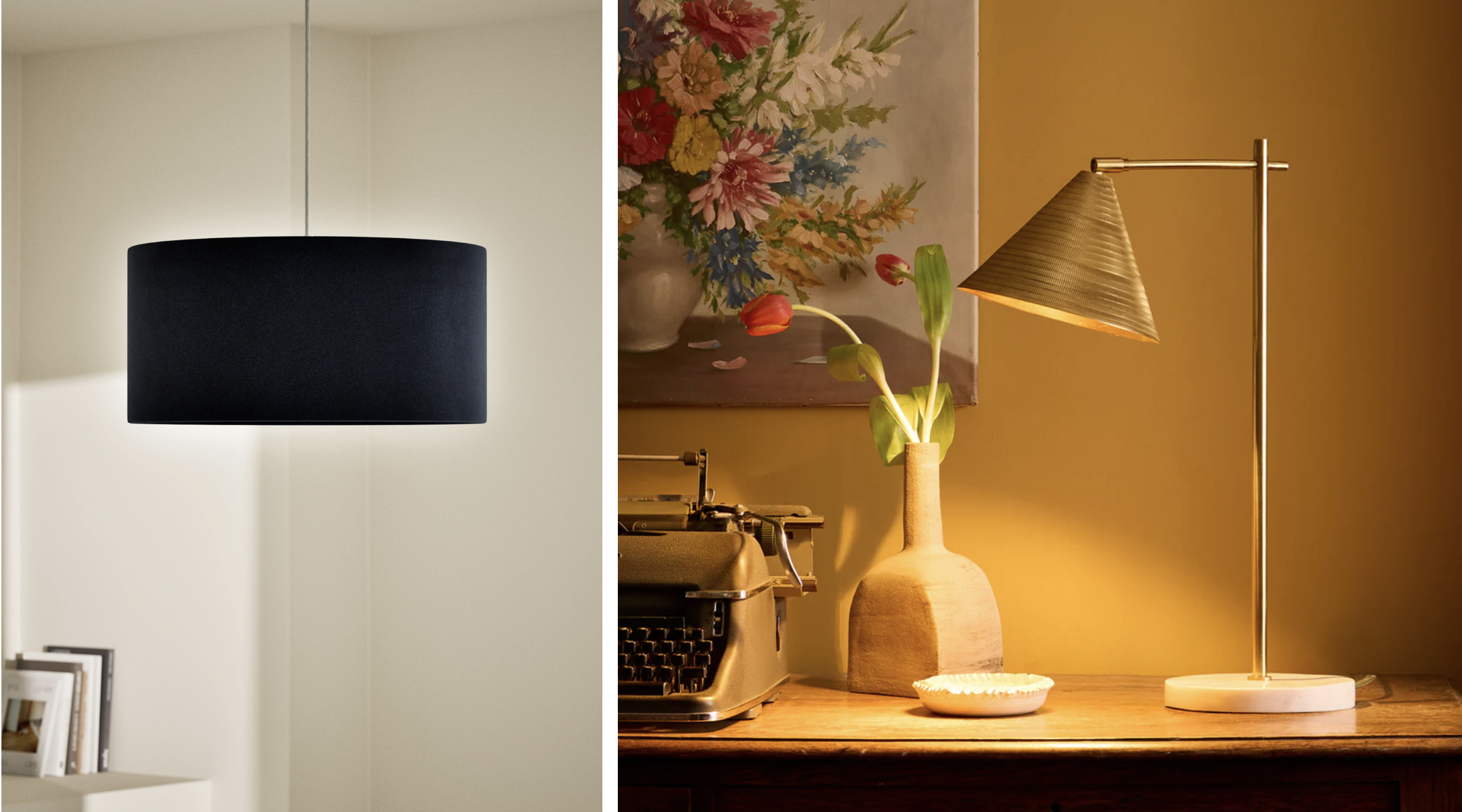
While most people may not realise it, lighting can make or break a room, regardless of how well it is decorated and styled. For example, having only one central bright overhead light in a room will make everything look stark and out of place. So too the choice of lightbulb, as cool white bulbs cast a cold glow compared with warm white ones.
Also consider the lampshades and how they diffuse and bounce light around a room. Natural examples in rattan, bamboo, raffia, cane or linen, for instance, will illuminate a room very differently to a dark-toned velvet or metal lampshade.
If possible, try to avoid overhead ceiling lights altogether and use multiple table, floor and wall lights to layer lighting, create interest and soften a space. This is especially key in living rooms and bedrooms, where strong lighting is usually not necessary.
Pooky is a good place to find inspiration for lighting and offers a range to suit all tastes. The rechargeable collection is particularly handy if you don’t have sockets where you need them.
3. Harsh paint shades
A straightforward paint shade like brilliant white might seem a sensible, clean option when decorating your home, but it can in fact leave rooms looking cold, stark and cheap. It also scuffs easily and reveals all blemishes.
On the other hand, an off-white shade, such as Shaded White by Farrow & Ball, is neutral yet warm. Dirty pinks also work well as warm and inviting neutrals – try Edward Bulmer Natural Paint’s Lilac Pink or COAT’s Sybil.
Indulging in strong colours can also risk making a home feel less special – for starters, avoid bright orange, lime green and brash purples, and choose your paint shades carefully. For example, there are deep purple shades that look rich and luxuriant and then there are bright purple shades that look gaudy and, let’s face it, a bit naff.
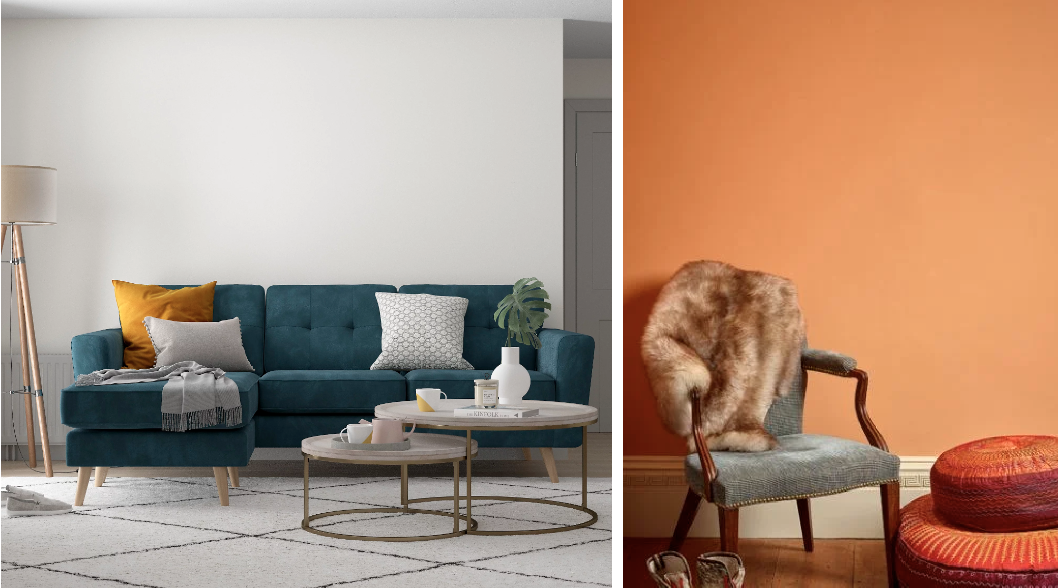
Opt for colours such as Annie Sloan’s Tyrian Plum, Farrow & Ball’s Pelt or Imperial Purple, and avoid white woodwork when using dark colours – consider colour drenching or using a dark complementary shade. Orange too can either be risky or right on point – instead of satsuma orange, try Farrow & Ball’s Sand or Edward Bulmer Natural Paint’s Dutch Orange (pictured above).
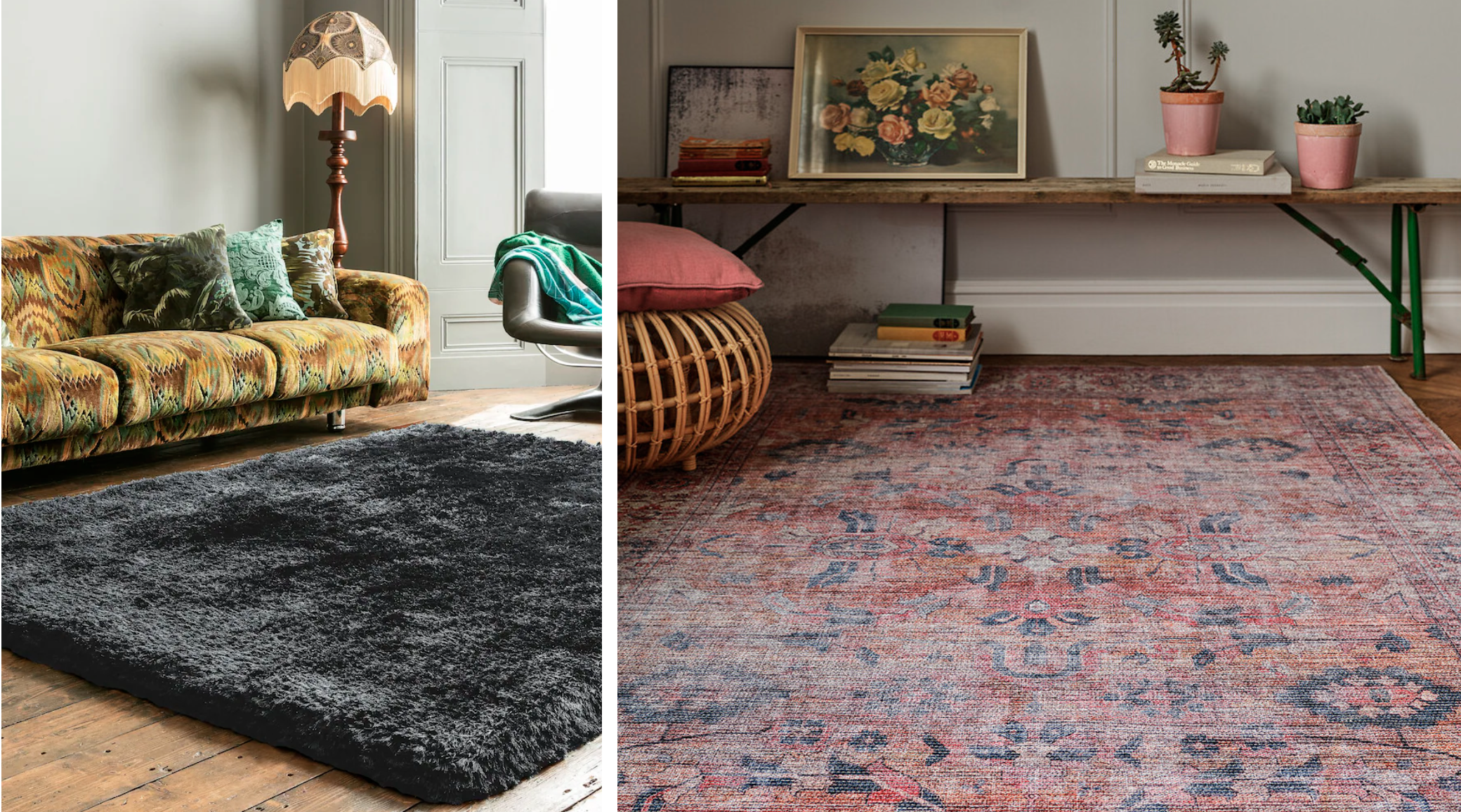
4. The wrong rug
Rugs should ground a room. Indeed, many interior decorators build a room around the rug. And because rugs are what pull a room together and transform a space, they can therefore also ruin it if not chosen or used well.
Size is all-important; you don’t want a rug that only sits under seating and associated tables (such as a dining table and chairs), and you should avoid something tiny floating in the middle of a room. If you have a small rug that you love, try placing it on a much larger sisal or jute rug that almost fills the space. Consider the colours and materials: avoid black or dark-grey shaggy synthetic rugs that will suck all light from the room.
Also, be careful with bold, colourful patterns. Instead, look for thick pile wool or antique Turkish examples. The simplest and most sustainable choice is a jute rug, but you may find this too bland. Try La Redoute for an affordable mix of stylish rugs or Yarn Home for antique and vintage designs.
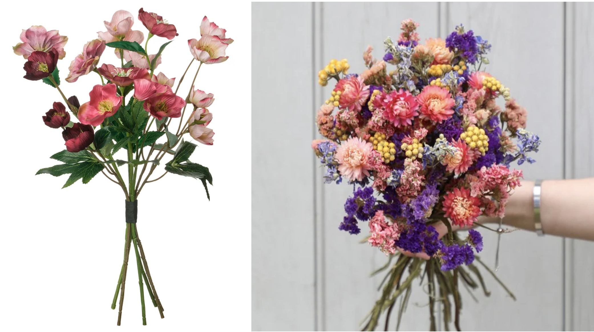
5. Too much faux
Let’s not pretend anymore. Faux materials in our houses rarely look like the real thing, and can bring down the overall feel of a home. While usually the cheaper option, they more often than not turn out to be a false economy.
Unlike the materials they’re trying to replicate, they simply won’t stand the test of time. Laminate flooring is unlikely to last as long as hardwood flooring, and the same goes for leather. Consider longevity when weighing up which option to go for, based on your budget.
What’s more, these mostly plastic alternatives just don’t look or feel right. If you would like to invest in everlasting flowers, look to sustainable dried bouquets from places such as Shropshire Petals (a family-run UK business).
This ethos extends to furniture and accessories too: ditch the plastic and MDF and choose vintage wooden furniture from fairs and markets, and feature luxe materials like marble in small doses round the house, as trays, bookends or coasters. Meanwhile, natural linen, seagrass and rattan can be quite affordable if you look around (see the likes of Pooky, Habitat and H&M Home).
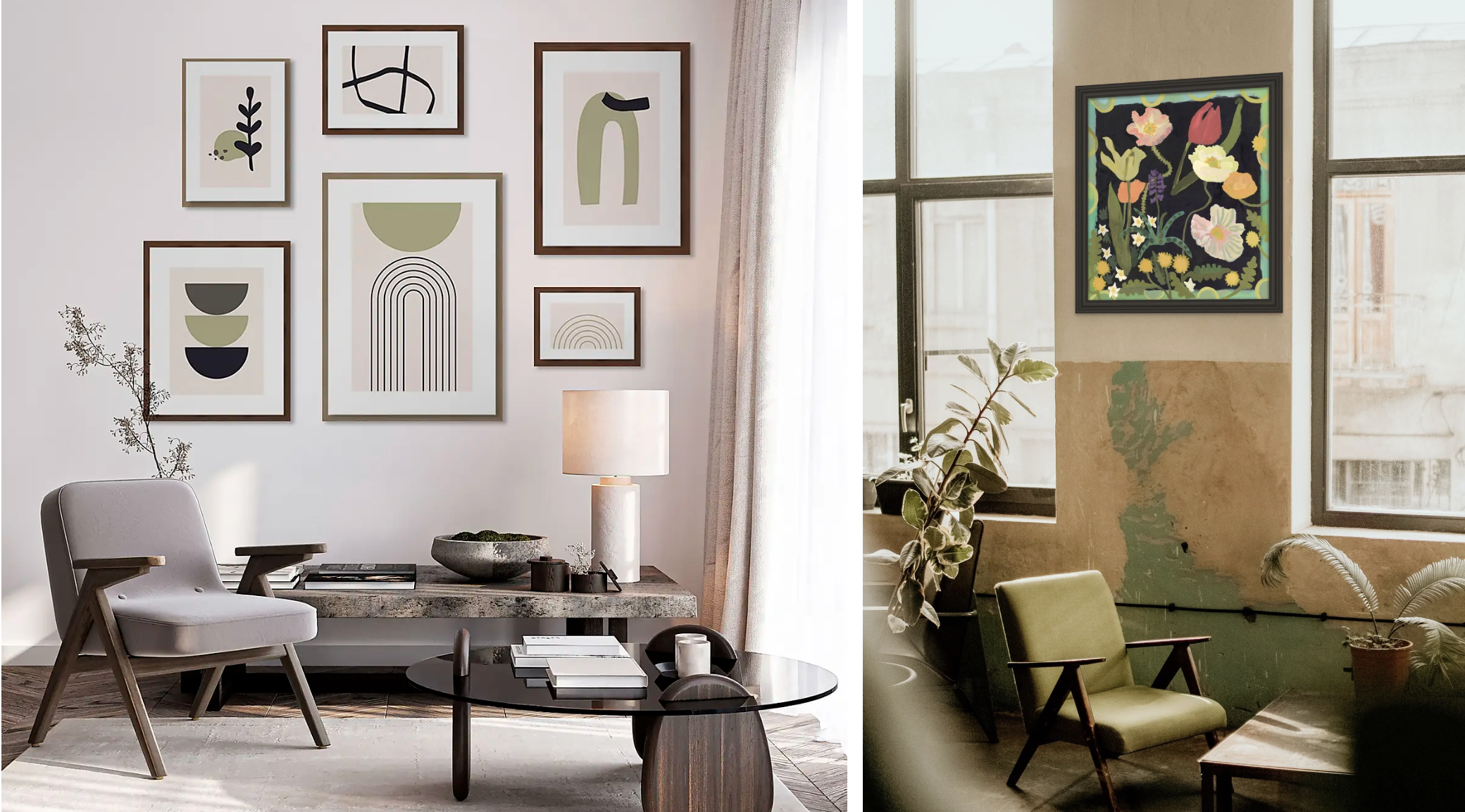
6. Bland art
Generic art in plastic frames, especially when hung badly, can easily bring down the tone of a room. Rather than simply grabbing some ubiquitous framed posters from high-street stores, take a more considered approach.
Even if affordability is an issue, small independent artists usually sell prints of their works at reasonable prices – some of our favourites include Claudia Lowry, Rosie Harbottle, Debbie George, and Georgie Richardson. Team with an old frame from a charity shop, or try wooden oak or glass frames from Nkuku. You could also paint a frame from Argos or Ikea in an interesting colour to add more character.
Images: Dunelm; Rowen & Wren; Marks & Spencer; Pooky; B&Q/Dulux; Edward Bulmer Natural Paint; Asiatic Rugs/Next; La Redoute; Ikea; Shropshire Petals; Dunelm; Georgie Richardson

