Take a look at any beautifully decorated home and you’ll find it’s usually filled with glorious patterns and textures, all of which are layered to great effect.
Colourful wallpapers and richly patterned textiles not only givea room character and life, but they also act as foils for fine furniture, decorative antiques, vintage pieces and other collections you might have.
Textile designer Molly Mahon, known for her exuberant block-prints, explains the enduring appeal of layering designs and colours: ‘There’s something nostalgic about using lots of pattern,’ she says, recalling the William Morris sofas at her childhood home. Frieda Gormley of House of Hackney thinks layering pattern on pattern and embracing colour is a wonderful means of expressing one’s individuality. ‘I see pattern as a chance to imbue a space with personality,’ she says.

Where to start when mixing print and pattern at home
Many interior designers begin by selecting a primary fabric, which they then layer with more simplified versions of the design.
Fabric and wallpaper designer Charlotte Gaisford says she always chooses her main fabric first. ‘Once I have my showstopper design I can find other fabrics to combine with my choice,’ she says. It amazes her that people focus only on choosing one fabric for a room. ‘It’s important to consider all the soft furnishings: cushions, upholstery, window seats, and so on. It would be boring if you used the same fabric for all of these. You need to think about the
whole scheme.’

Always consider the scale of the prints and patterns that you choose
Interior designer and broadcaster Sophie Robinson recommends ensuring there are plenty of prints in varying sizes in the mix: from slim, ticking stripes to oversized florals. ‘I tie these together with a tight colour palette,’ she explains. ‘Often, I’ll start with a hero fabric like a detailed chintz and from that spin off the colours into stripes, geometrics and other florals. Seeing them all jostle next to one another just sparks joy for me.’ Molly Mahon agrees that scale is important. ‘It’s calmer on the eye to sit big patterns next to little patterns, rather than having lots of small designs.’
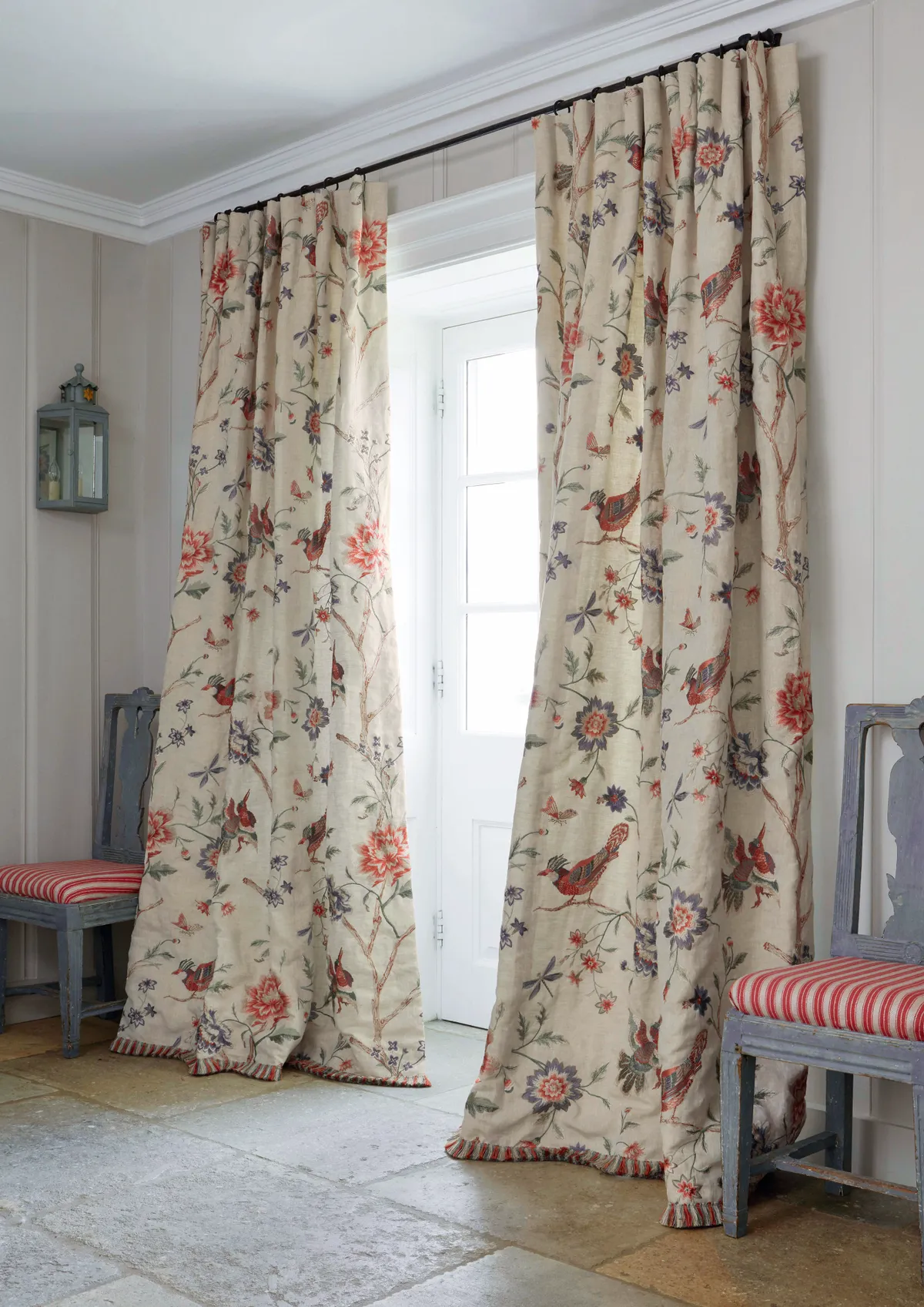
Observe how patterns behave on different materials
‘The thing to understand,’ says interior decorator and antiques dealer Robert Kime, ‘is that on a fabric you won’t always see pattern the way you see it on a wallpaper. Patterns on wallpaper are viewed flat, so they have a different effect and impact than fabric, which is often gathered.’
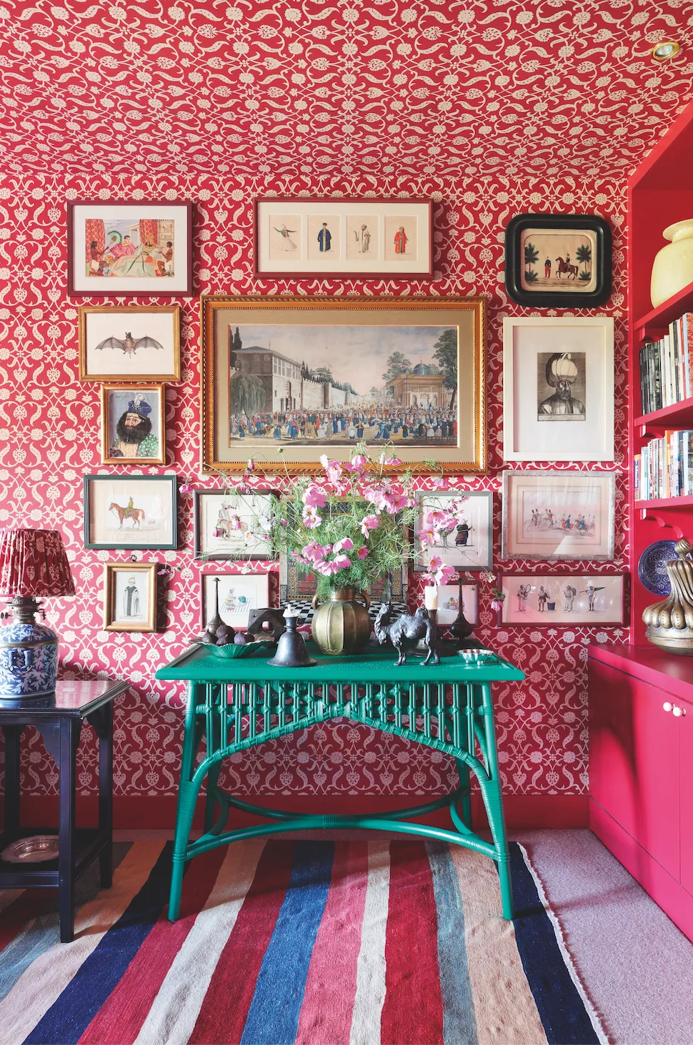
Although it breaks the traditional rules of decorating, and takes confidence and a good eye, top-to- bottom entirely matching schemes are having something of a moment. This approach not only makes a serious statement, but it can result in a wonderfully cocooning effect, which is especially good in a bedroom or bathroom. ‘I’m agreat proponent of covering all the surfaces of a room – walls, ceilings and upholstery – in matching wallpaper and fabric to feel enveloped in the most cosseting way,’ says Lulu Lytle of Soane Britain. Frieda Gormley is also a fan of this ‘surround-sound’ look. ‘Our approach is totally fearless,’ she says. ‘But if you’re on a budget, just wallpaper the ceiling and paint the walls – the effect will be dramatic, unexpected, and utterly mesmerising.’
Combine patterned wallpapers and textiles for a harmonious look
The real secret to combining a number of richly patterned wallpapers and textiles successfully, Frieda says, is by ‘creating beauty and harmony through a cohesive colour palette
in each room. Print-on-print looks great when the tones are similar. Alternatively, you could use the same print in contrasting colours to create depth and interest, say by toughening up soft pink with petrol blue or black.’ She also suggests picking out the tonal highlights in a print and painting woodwork the same shade.
Molly Mahon suggests choosing a selection of colours that are uplifting and to simply shrug off any so-called rules about colour combinations. ‘Some people can take colour more than others,’ she says. ‘I can live comfortably with lots of colour. I love red and pink. People say certain colours clash, but do they? Do they clash, or do they sing?’
If you keep differing patterns the same colour, you can clash these with bolder colours elsewhere in a room, says Charlotte Gaisford. ‘Although my drawing room has lots of pattern, I actually used a fairly simple concept. I chose contrasting colours of green, red and gold for a strong, dramatic effect, but I put together six different patterned fabrics in the curtains, cushions and lampshade, using the same colours.’
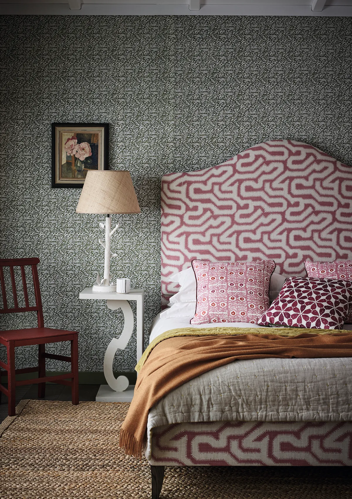
Use different textures to add depth to a scheme
Texture is another part of the puzzle when playing with pattern, and it is the key to layering and essential for adding depth to a scheme. ‘It’s always good to try to incorporate patterns of different textures, such as weaves, heavy linens, stripes and florals,’ says interior designer Penny Morrison.‘I always try to include some vintage textiles, maybe on the cushions or
on a single armchair.’
Mix and match patterned accessories for an eclectic look
Accessories such as cushions and lampshades also allow for experimentation without a hefty price tag. ‘Pops of pattern and colour make a huge difference,’ she says. ‘This can be patterned lamps, or lampshades, cushions and rugs over the back of a chair or sofa. I like vintage Swedish rugs in particular, but any rug can pull a room together and they are so easily changed.’ Robert Kime agrees. ‘We start every project and room with the rug and
go up from there. An antique rug can carry a space and provide a kind of base – colour is more directional, but a rug fully sets the tone.’
Molly Mahon finds that people become braver and bolder as they begin to introduce more pattern to their interiors. ‘We always suggest that you start with a cushion or two and build from there. Then add a lampshade, which will add instant interest. It’s a good way to adjust to living with more pattern and colour.’ Charlotte Gaisford heartily agrees. ‘Add pattern slowly, and enjoy shopping for the different elements. Make the room an experience in its own right.’

Words: Rosanna Morris

